Karan Singh
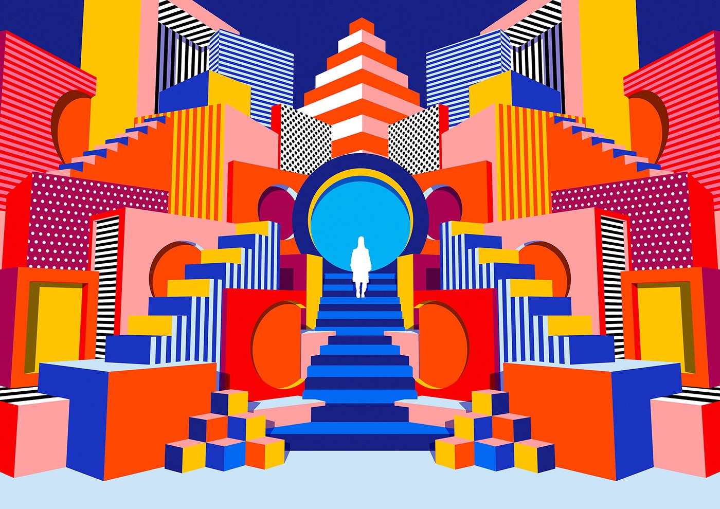
IMAX Melbourne Campaign by Karan Singh
Karan Singh is an Australian artist and illustrator with a distinct style featuring bold, vibrant colors and strong, solid shapes. A self-taught artist, he has focused on visual arts and illustration for the past 12 years, drawing inspiration from graphic design sensibilities and op-art minimalism. Over the course of his career, Karan has spent time based in cities like Tokyo, New York, and Amsterdam, and he has worked with a range of clients including Apple, Airbnb, Nike, and the band OK Go.
Hi Karan! Tell us about yourself, how did you get to where you are today? When did you first become interested in art and design?
I often call myself a self-taught artist and illustrator. I studied for a design degree when i was at university, but it was much more technical and had a lot to do with programming. I was always much more interested in drawing, it’s something that I’ve been interested in since I was a kid. Growing up I’d often copy little projects from a TV show called Art Attack and try and replicate them at home. It wasn’t until after I left university that I realized that illustration was actually a career that you could have and it sent me on this trajectory of navigating the design landscape and creative industries. I became a designer with a very green, naive, and excited approach about how I wanted to grow. Everything I saw around me got me really excited about design. It’s been an interesting journey, but it’s been an entertaining one too.
Artist and Designer Karan Singh
How would you describe your aesthetic and how has it changed over time?
At its core is minimalism - though people might not see it that way. I’m always very conceptually oriented and my approach is focused on the key idea I’m trying to communicate through the work. My art process is often a case of taking things away from a piece until that key idea stands by itself without any unnecessary decorative elements. So, ultimately I would say at its heart it’s minimalism, but from an aesthetic perspective my style has really evolved from very minimal line work to op-art and Memphis Milano movement-inspired. Now I’m in sort of a weird 80’s airbrush aesthetic, which i’m digging. I’m trying to challenge myself again by seeing what I can take out of an illustration. I’ve really become associated with my pattern work, and now I’m trying to see what my work is like if I didn’t do that. One thing about my artistic process is that I’m not ever really content and I think it’s like an iterative process for me. I have to constantly iterate, because as soon as the process becomes formulaic, then I’m not having fun.
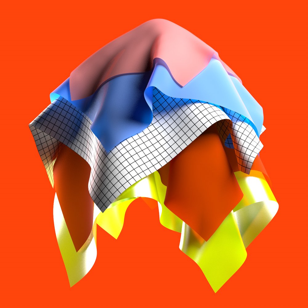
From a series of cloth inspired animations installed at Duvetica Tokyo as part of Aosando Art Fair
Can you share more about what your creative process is like?
I usually start with a fairly exhaustive thumbnail sketching process where I try to exhaust the idea for a concept with as many thumbnails as possible. What happens is when I do this exercise, I feel like before I jump on to the computer I’ve already exhausted primarily compositional ideas - element-based ideas and land on what specifically I’m trying to communicate and how I want to communicate it. From there, I jump onto the computer. Lately i’ve been using Cinema 4D a lot, but prior to that it was 100% Illustrator. Once I’m on the computer it’s just trying to refine and hone the idea without it taking you over.
I think one key part of my process that was incorporated into my mindset quite early on is that I try to finish things as quickly as possible. I know that sounds haphazard as an artist, but I have a tendency to overthink things and I’ve found that if I set a deadline to finish something, then I can always draw a line under it and say “hey look, that looks great and I’m happy with it,” or “hey look I didn’t nail it this time let’s get it next time and make it better next time.” I think completing the process is actually really crucial - seeing an idea all the way to the end is really important because that’s the only way I can start the next piece and learn from what happened before.
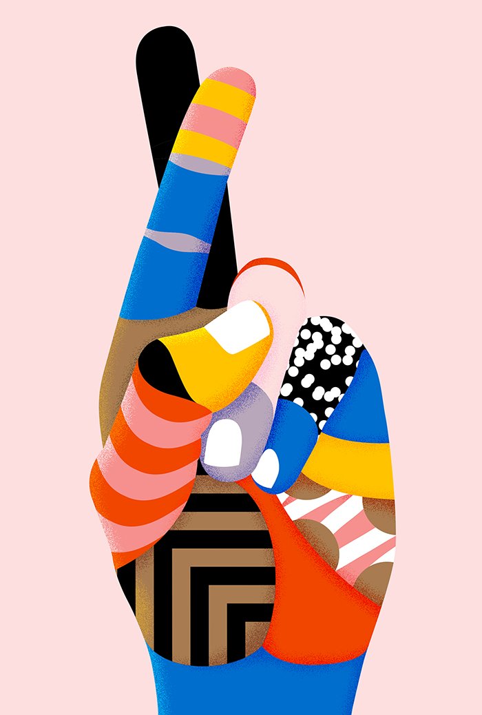
Image from Karan’s debut solo exibition, Potluck at Lamington Drive in Melbourne and Goodspace Gallery (as part of moVement Festival) Sydney in 2016.
The body of work explores our relationship with superstition and how everyday objects and gestures are empowered and enshrined as we impose meanings upon them, dramatically shifting their purpose and meaning.
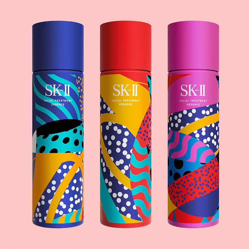
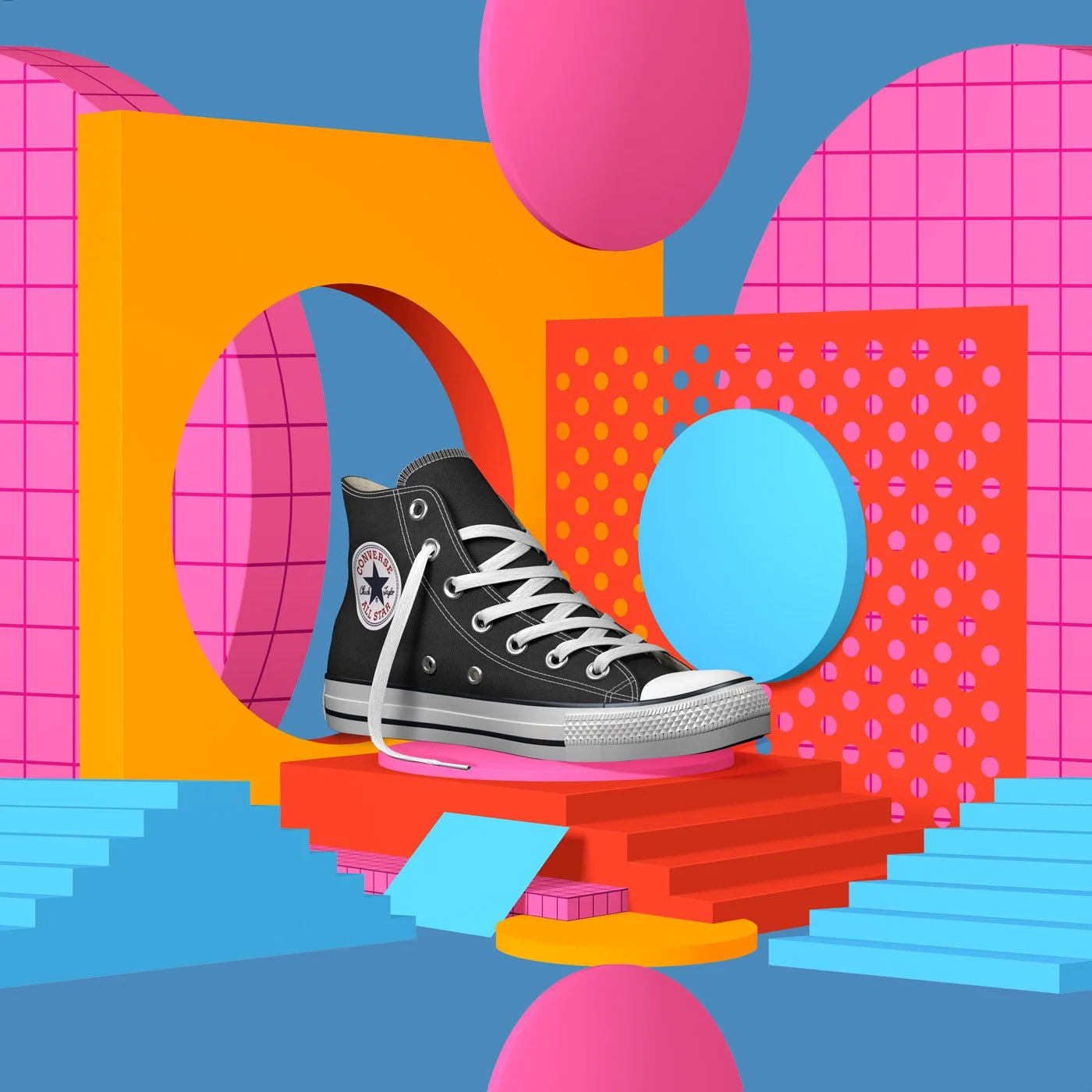
You’ve worked with a range of clients including Apple, Nike, SK-II, Louis Vuitton, and the 93rd Oscars. How do you approach creative collaboration with your clients?
Most of the time I’m working in a sort of solitary confinement. That sounds really grim, but I’m working as an artist and creating art is somewhat of a selfish process, so collaborating on a brief with a client is actually fantastic because it incorporates constraints for me to work within. It’s less about a selfish artistic execution and more about answering a design problem. When you work in collaboration with clients, the people briefing you are experts in their own fields and they know the brand, product, or campaign in a unique way. What I usually like to do is have like an open conversation with the clients about where they see the work going and why they chose me specifically. I try to ascertain what they want from me and then I usually navigate a three round process where there will first be a rough sketch phase. This is always the most daunting because you had all these verbal conversations, but now you’re trying to extrapolate those conversations into visual ideas. The reason I think those are most daunting is because it’s like a blind date! I don’t know if I’ve presented the right thing, or if i’ve interpreted the idea - so what I try to tell myself about that first phase is that the point of the rough phase is that it’s rough. You then use that as a benchmark to realign your ideas - or sometimes you might get it on the first try and that’s fantastic when you do, but when you don’t it’s important not to think of it as a failure.
I think that sometimes as designers we put a lot of pressure on ourselves to nail a brief the first time around, but that’s just not going to happen. The collaborators I prefer to work with are receptive to that. After the rough phase, we refine it once we have a good solid concept there. The refining stage involved developing the rough sketches into advanced art, cleaner lines, and incorporating colors. At every juncture in the process the client has the opportunity to offer feedback. I like to think that we’re collectively steering the ship. There are also times where I will push back and say “hey look, this doesn’t feel right,” “this is veering out of my aesthetic,” or “this doesn’t feel like we’re answering the brief.” It’s about dialogue and making sure you feel like equal parts of the relationship that you’re in.

How do you decide which projects you’re going to take on and what does a work day look like for you?
I used to go to a lot of design conferences when I was much younger and a common theme was always “say yes and figure it out later.” That was really good at the time, this mentality of “screw it, I’ll say yes, I don’t know how to do this but I’ll work it out.” But, that approach only gets you so far. With time, learning how to say no and developing the confidence enough to say no is important, though scary. Saying yes exposed me to a lot of different kinds of work but eventually, over time, I noticed that I liked working on certain projects more than others.
What kind of personal projects do you spend your time on and why are personal projects so important to your practice?
Going back to my previous answer about turning down projects, part of what’s inspired that is also acknowledging that I can turn down a project and spend time on myself instead. I think carving out personal time is so crucial because the personal work that I spend my time doing is what facilitates the work I’ll do in the future. Something I was taught early on is that the work you’re showing in your portfolio is the work you’re going to be commissioned for. If there’s something in your portfolio that you don’t want to be commissioned for, then you should take it out and replace it with the things you want to work on. I’ve definitely tried to formulate how I approach my personal work. I really like pattern work - it’s really fun, it’s had a lot of success but I think it got to a point where it became too formulaic and repetitive for me. I thought about what it would feel like if I challenged that and took away that identifier in what I’m working on. So, yes, I try to make time for personal work and it’s important to invest time into personal projects because it helps shape what you’ll be working on a year from now. If you’re not doing it now, that’s what you’ll be doing a year from now.
Animations and illustrations created with Sagmeister & Walsh for the rebrand of Appy Fizz, a popular Indian soda.
What’s one of the biggest lessons you’ve learned throughout your career thus far?
I definitely think it’s that saying “No” is incredibly empowering. Going back to how I started illustrating - it was in my bedroom as a kid and the fact that this is what I do for a living now still is really quite overwhelming for me sometimes. Quite early on I was eager and willing to please and then as soon as design becomes your occupation it starts to encroach on all aspects of your life. This was my hobby originally and now it’s also my profession. Creating a framework where you can separate your work life, your home life, and social life is very, very important. That separation creates a much more balanced designer who doesn’t hate what they do! It creates a bit more longevity in terms of your career.
What advice would you give to designers just starting out?
Part of the lifecycle of creating personal work is going through the sketching and the development phases, but now it’s also sharing that work. My advice to young designers is to make work and share it often. Get your work out there so people know that you’re making stuff. It can also serve as a personal journal to see how you’ve evolved. It’s fine if you want to keep your work locked up - but put it out there! Get feedback and collaborate with other people. That’s more or less how I learned, through online art communities. They’ve changed in terms of what they are now (Instagram, etc.) but the core of it is still an online concentration of people who are interested in the same stuff I was and could get feedback from. Don’t work in the shadows too much.
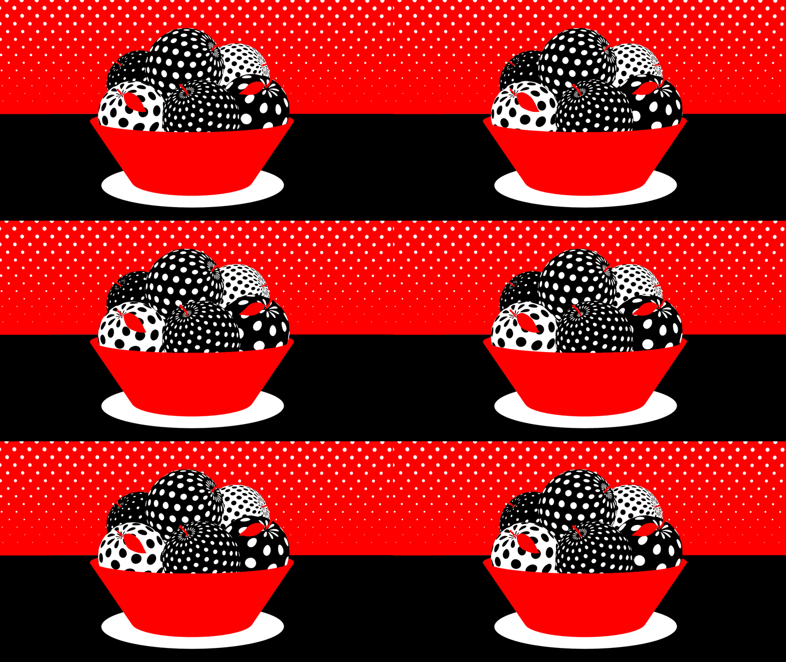
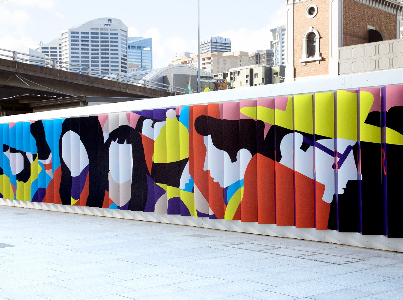
One of a series of wide patterns and illustrations created with Houston Group in Sydney for the Darling One site's hoarding. Photography: Houston Group
Do you have any favorite design tools or resources?
A good old fashioned pencil and sketchbook! Digital tools are getting so much better and sometimes when I start using digital tools too quickly in the design process I get distracted before I’ve worked out what the idea is. A pencil and paper keeps you honest and keeps you focused. I think that’s the most necessary tool in my arsenal to keep me focused and create a good foundation for a healthy, strong project down the road.
There are a few books I go back to, one in particular by a Japanese graphic designer. I just love his ideas because of how he reduces ideas into core principles and this is something that inspires a lot of my work. Lately I’ve been into a lot of retro 80’s stuff - I’m an 80’s baby so I like going back and reminiscing. Little nostalgic bits, nostalgia is definitely inspiring my current work.
When you look to the future, what are you excited about?
I’m excited about doing more personal work and working on a new exhibition. It’s something I’ve really been thinking about every day. I have a studio now here in Melbourne, a space I can work on creating more sculptural things. It’s always been about taking my work off the screen - a lot of my work is inspired by tangible objects, so it only makes sense to make a tangible version of these surreal objects as sculpture.
Thank you for sharing with us Karan! To view more of Karan’s work, visit his website and follow him on Instagram.
Karan was nominated by Noun Project. All art courtesy of Karan Singh.

