Skinny Ships
Target Halloween 2022 Campaign
Skinny Ships is design duo Richard Perez and Jennifer DeRosa. Since 2013, Richard and Jen have collaborated on design, illustration and branding projects for clients like Target, Google, and Fitbit from their studio in Portland, Oregon. Their distinct style features strong, solid shapes and bold colors.
Hi Richard and Jen! Tell us about yourselves - how did you get to where you are today?
Jen grew up on the East Coast in Connecticut and Richard grew up in the suburbs of Los Angeles. We met while in art school in San Francisco, and instantly bonded over our love of MST3k & underground hiphop. After we finished design school, we worked for various studios and companies in SF. During that time, we were working on our own illustrations and building a modest freelance list of clients. Eventually, we both had enough steady clients we could go out on our own.
After 8 years in the city, we decided to move our crew (which included two cats, Buffins and Tibbles) to Portland Oregon where we’ve lived and worked since 2013.
Richard Perez and Jennifer DeRosa
What led you to join forces and create together as Skinny Ships?
Richard initially took the moniker of Skinny Ships while in art school. I remember getting many requests thinking that Skinny Ships was a studio and not just one person. After years of working independently and helping each other out we actually joined forces and started studio…. and charging studio prices!
How would you describe your design style and how has it changed over time?
We originally started out with very clean, geometric line work, which was all the rage in the mid 2010s. As we’ve grown, we’ve gotten looser and tried to be more experimental with incorporating more texture, exploring 3D elements, and bringing animation into our work.
We think it’s vital to keep trying to evolve and grow, all while trying to maintain the Skinny Ships vibe: bold vibrant colors and strong solid shapes.
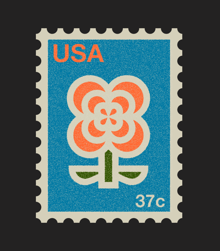
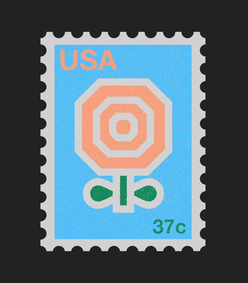
You’ve worked with a range of clients including some of the world’s best known brands like Google, Slack, Target, The New York Times and more. What is your creative process like?
We’ve been lucky to have worked with some great clients both big and small. Our general process is pretty straightforward. First, we create a couple of sketches on paper or procreate if the iPad is charged up. We then bringing things into Illustrator or Figma to clean things up, then finally bring the artwork into Photoshop to mess things up.
How do you approach creative collaboration with your clients and with each other?
Richard will sketch out an idea and Jen will make a comment add her own spin on the work and vice versa. We like to keep collaboration between ourselves loose and open, and we try to approach our work with clients in the same way.
What’s been one of your favorite projects to work on so far and why?
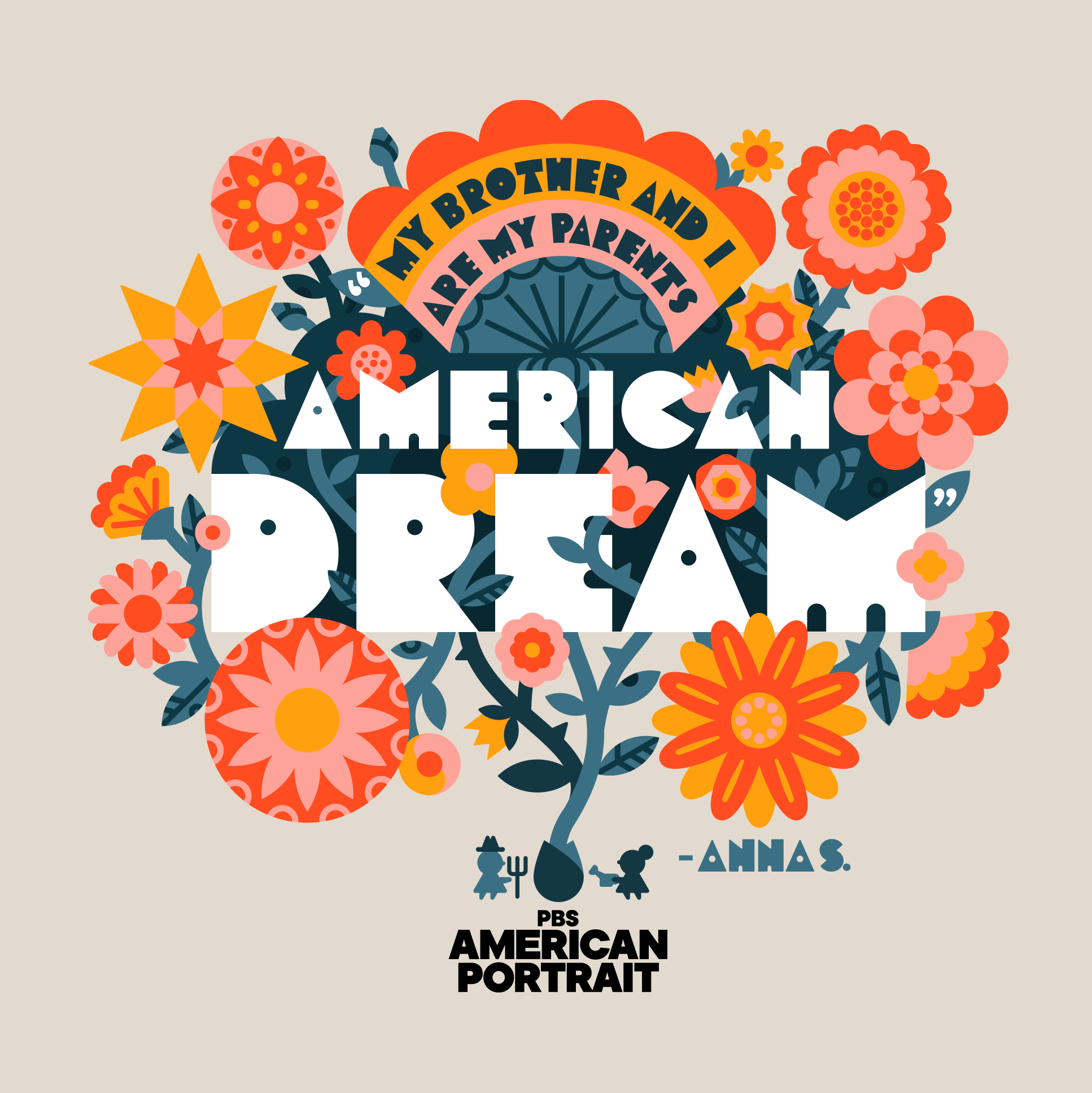
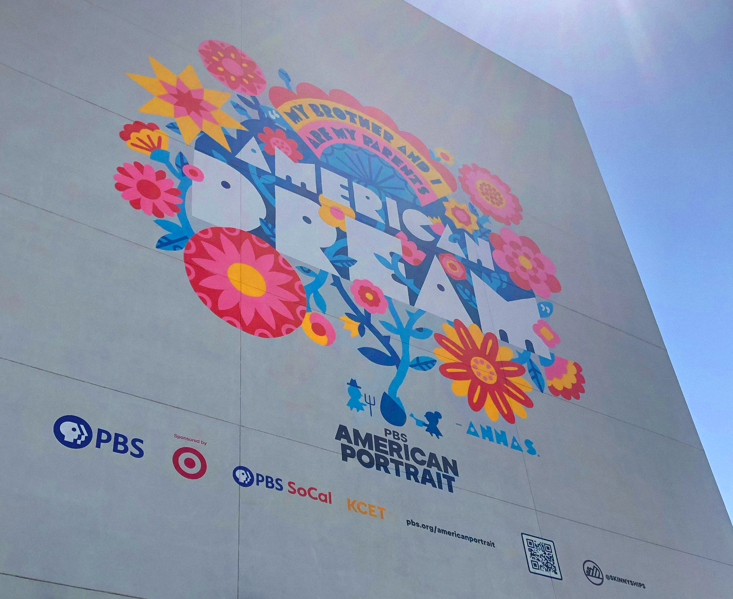
The mural we created for the PBS American Portrait project in 2020 has been one of our favorite things to work on in the past few years.
Apart from seeing an illustration we worked on at such a scale on the side of a building, which was amazing, there was something special about the messaging behind the artwork, being the son of immigrants and it being in Richard’s hometown of Los Angeles. Since it was created during the height of the pandemic, it provided positive message to the community.
Do you have any favorite design tools and resources?
We’ve got an extensive library of design / art / kids book that we’re constantly looking towards for inspiration or when we hit a roadblock. It’s hard to pick out anything in particular, but a Mary Blair Golden Books and monographs, a collection of Cuban poster and film poster books, and the Chris Ware Acme Novelty Library are pulled from the shelves a lot.
As far as intangible resources, we’ve got a few design sites on our bookmarks, that we frequent. Fontsinuse.com is always a great source and we love the tools that truegritsupply.com releases.
We’ve also been lucky to be a part of a couple of small communities of designers who we can count on, to reach out with questions, ask for feedback or just vent when needed!
Where do you find creative inspiration?
Video games, going record shopping, and thrifting in general. We love old junk! Plus, we think the best inspiration comes from taking a break from the computer and looking for inspiration outside of usual channels. Thrifting, you might find a fun vintage box art or a kitchen gadget, or weird covers with funky type, or even a cheap-o 70s sci-fi novel.
What advice would you give to designers who are just starting out?
Keep at it! I feel like in this industry it’s easy to feel beaten down, especially with how quickly things are changing and with things like AI creeping into the picture. But as a duo who has been at this for almost 15 years, we’re here to say that there are plenty of ups and downs. Hang in there.
Thank you for sharing with us Richard and Jen! To view more of their work, visit the Skinny Ships website and follow them on Instagram.
Skinny Ships was nominated by Noun Project. All art courtesy of Skinny Ships.


